Case study · Icon system · 2023
Under Armour
An icon system drawn from
the geometry of play.
- Client
- Under Armour
- Role
- Iconography designer
- Team
- Two creative directors, two designers
- Agency
- YML, now part of Code and Theory
- Duration
- Six months
- Surfaces
- UA.com · Apps · In-store


01 · The ask
An icon suite that honors Under Armour’s legacy and its future.
Surface
UA.com
Surface
The apps
Surface
In-store
One system had to work for four
Under
Armour teams
at once: UX,
Lifecycle,
Retail
and Loyalty. The same
icon
needed
to hold up
on a product
page, inside the app
and printed
on a store fixture or hang tag.
How it came together
From a handful of sketches to hundreds of icons.
3
Directions
The team presented three distinct directions to Under Armour.
8–10
Sketches
A junior designer, Chelsea Jones, joined to help kick off concepts. The client chose her direction, a small set of sketches with a clear point of view.
100s
Icons
I designed the rest. Months of sketching and refining with the client, our creative directors and stakeholders, every icon drawn by hand in Figma and Illustrator.
02 · The gap
Industry-leading technology, nearly invisible while people shopped.
Sun protection, water resistance,
support
level and rise were
buried
in product copy.
Shoppers had
to read
to compare.
The icons
let
a fabric’s
performance be
understood
at a glance,
in the same
way on every surface.
Before and after
What shoppers saw in 2023.


The icons Under Armour used
across UA.com
and the apps
before
the redesign.
03 · The concept
Athletic Geometry
- 01
Start from the shapes of courts and fields, the lines every athlete already knows by heart.
- 02
Turn familiar sport symbols and equipment into metaphors that feel new but a little nostalgic.
- 03
Let sharp angles meet curved lines, so even a still icon carries movement and energy.
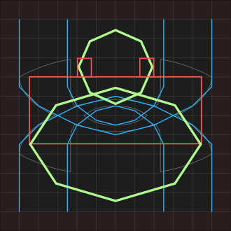
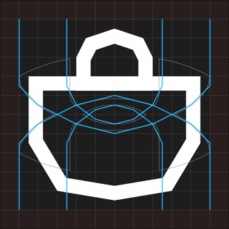
Core shapes
The grid
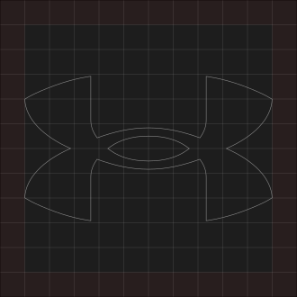
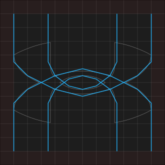
A grid built from the Under Armour mark.
One 12 × 12 grid that scales to pixels or inches.
The logo sits inside it, so every icon is built
from the brand’s own angles.
04 · Testing
Three explorations, then shoppers and athletes decided.
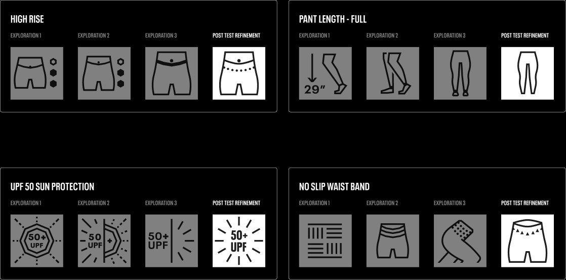
High rise
The belly button made the rise
obvious, so it stayed.
UPF 50
People didn’t read the octagon
as a sun. Open rays did.
Full length
Length read clearly, but feet got confused
with socks, so they went.
No-slip waistband
Shoppers liked one direction
but read
it as compression,
so I refined it.
05 · The set
Every icon, up close.
Hover or tap an icon to bring it forward. A selection
from
a system of hundreds. I designed the sport pictograms
myself, in the system’s visual language.

Performance
High support
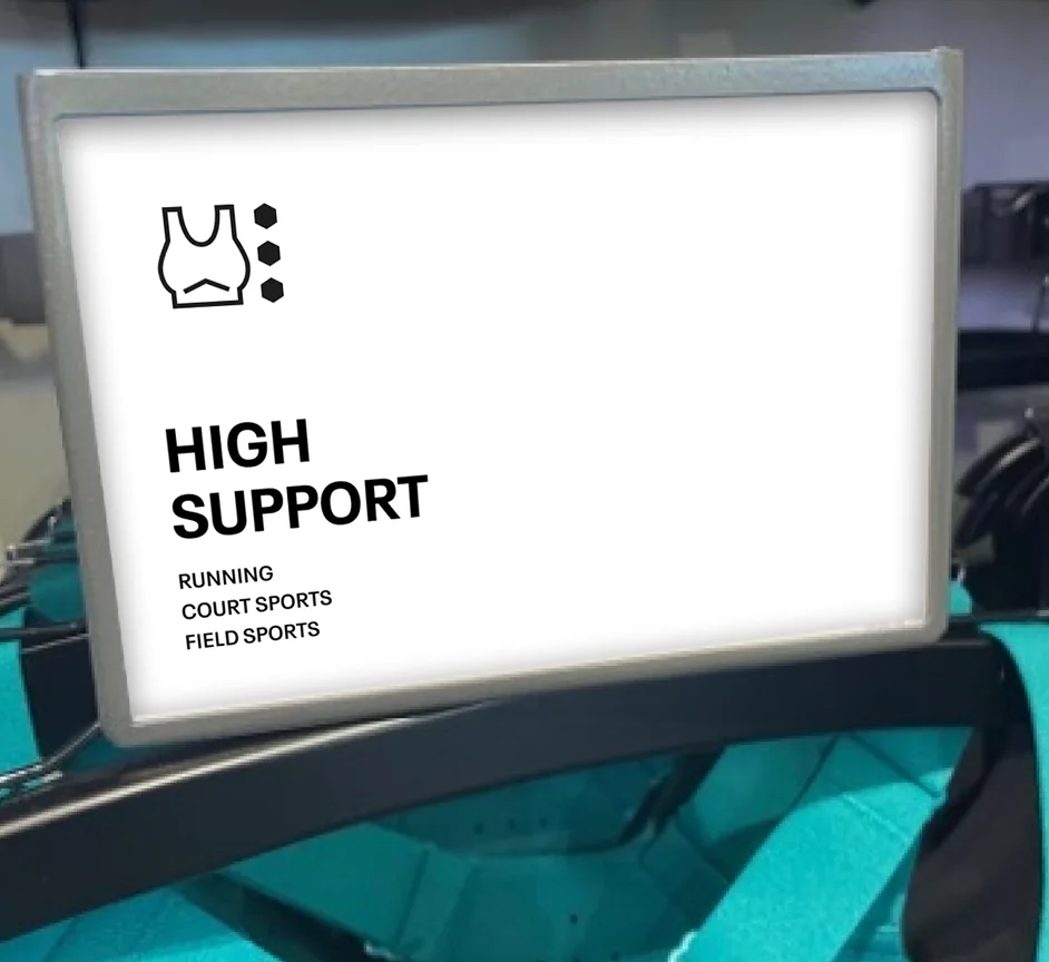
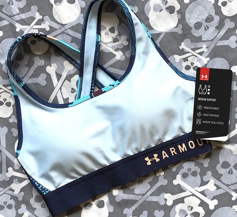
Three hexagons for high support, two for medium, one for low. It reads like a fit guide.
At 48px the hexagons stay distinct, so the support level still reads on a phone or a hang tag.
06 · In the product
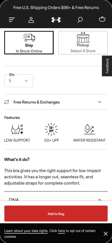
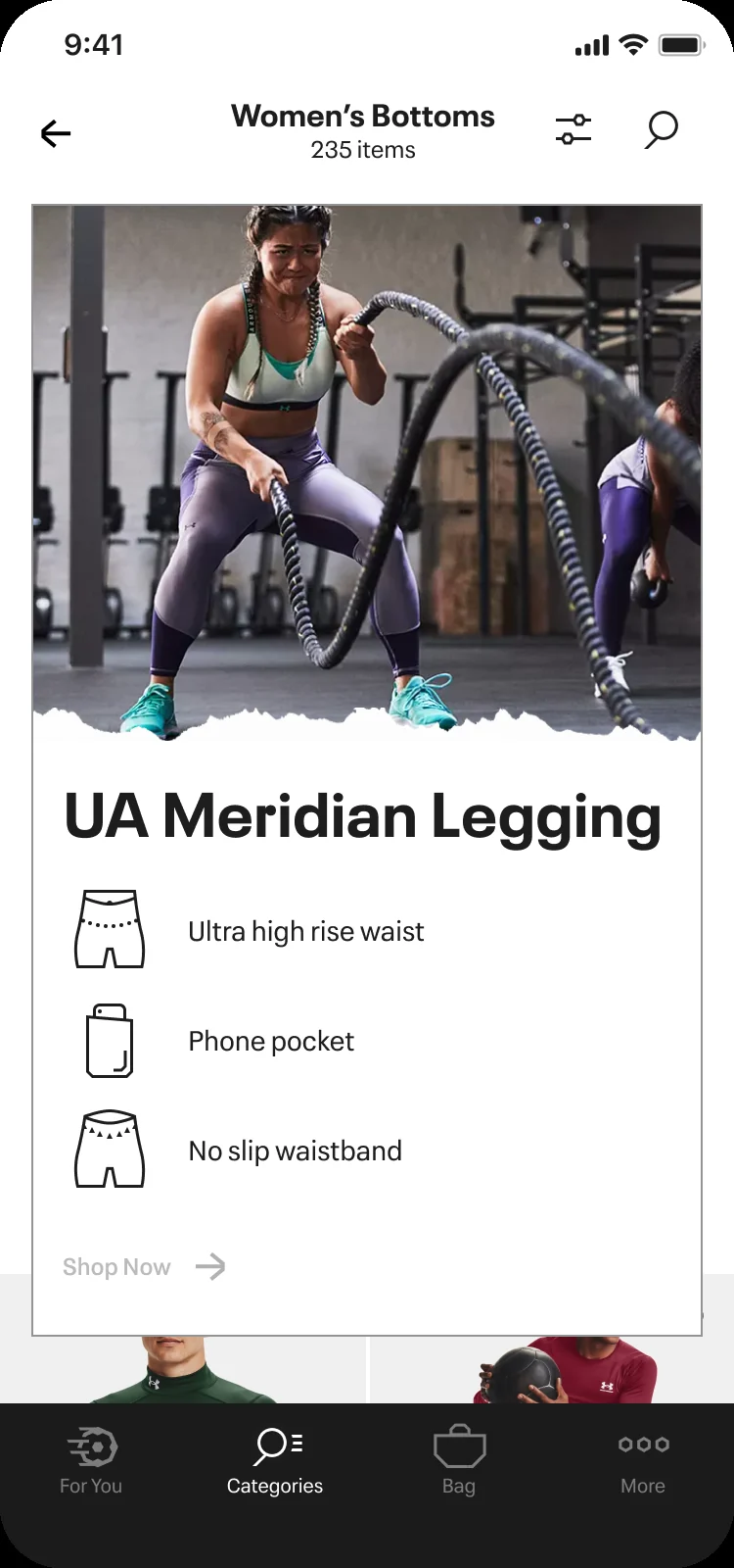
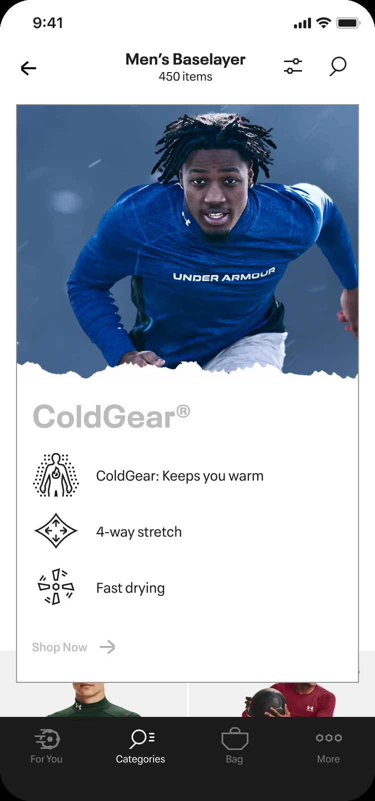
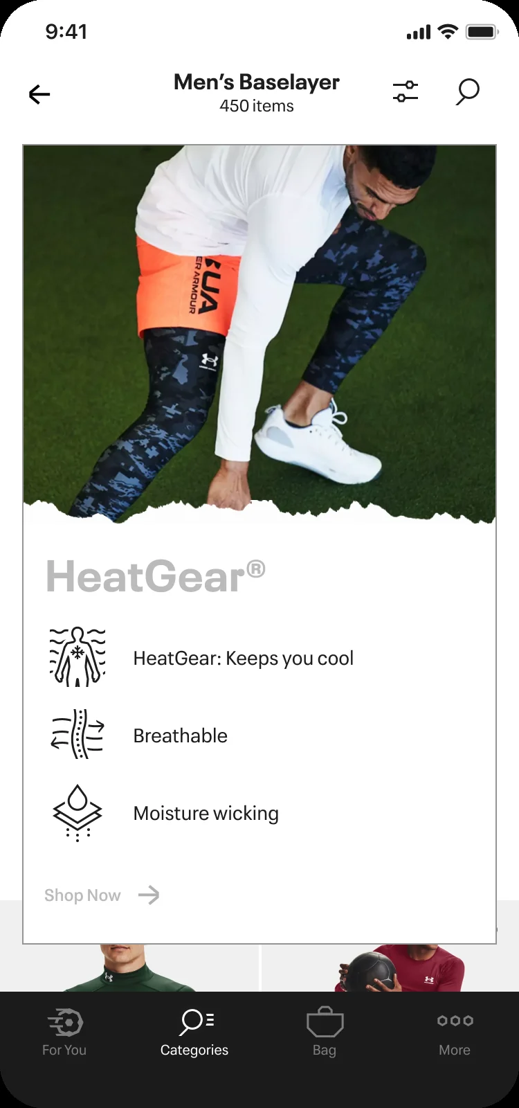
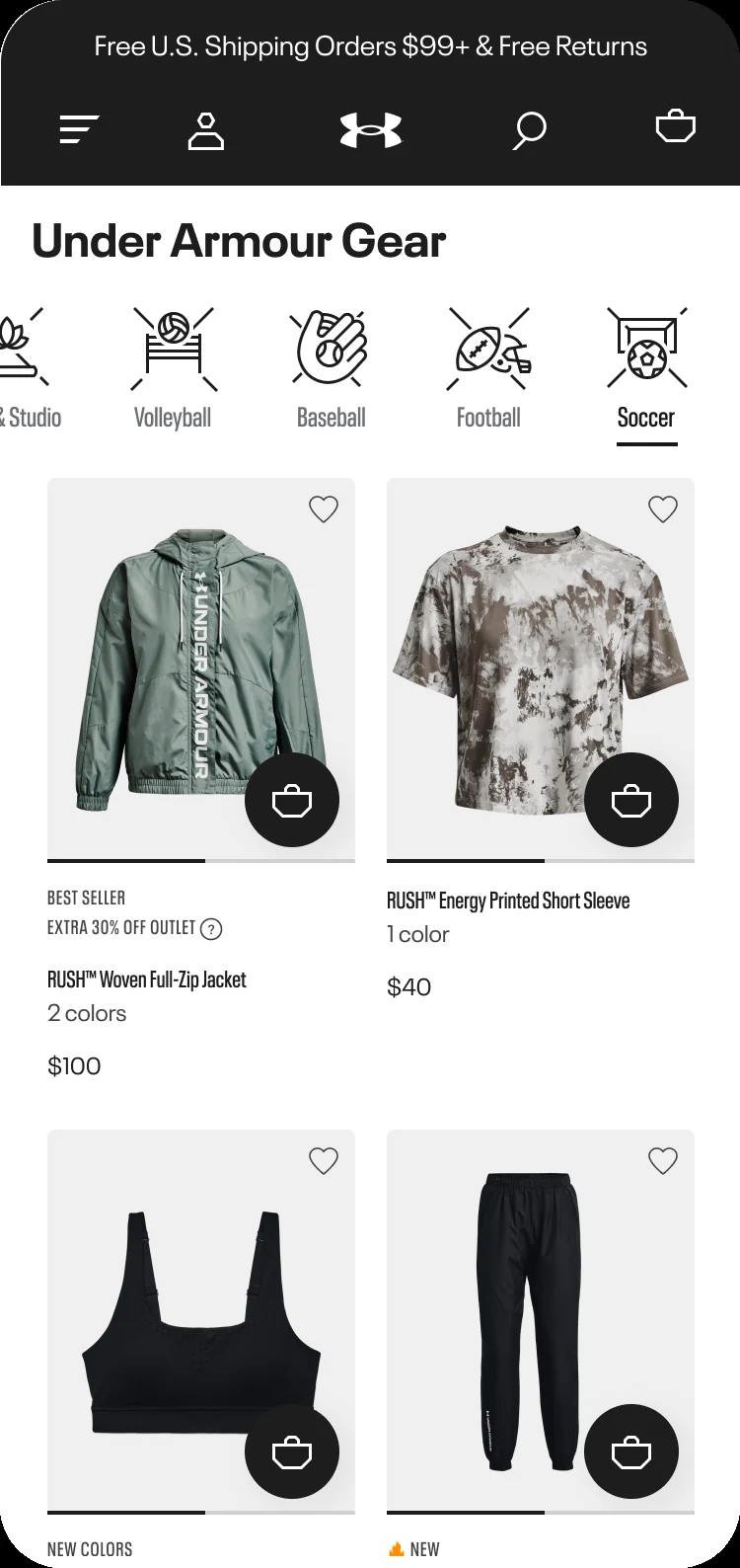
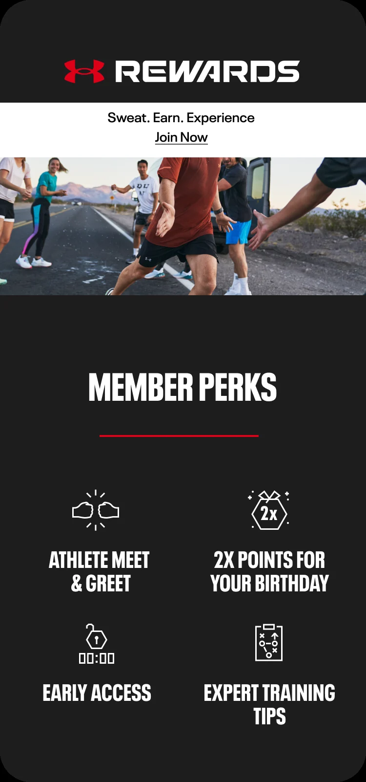
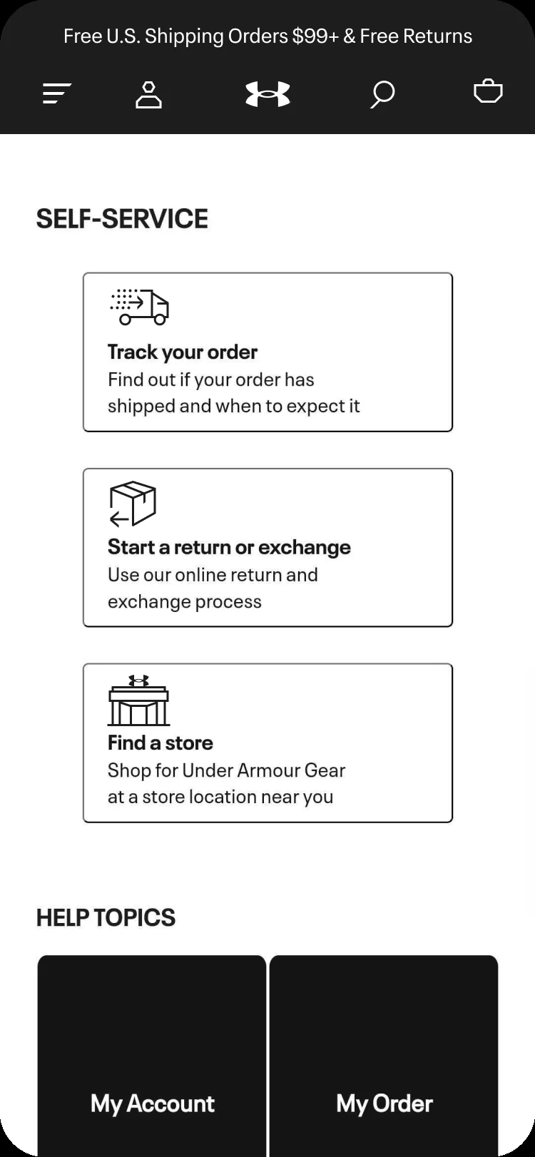
From product page to the app.
Mobile · UA.com and the app
In store
The same icons, off the screen and on the rack.
“We have been dreaming of a system that UA could uniquely own and here it is.”
Credits
Made at YML, now part of Code
and Theory, 2023.
- Iconography design
- Maher Sinjary
- Initial concept sketches
- Chelsea Jones
- Creative direction
- Soli Moshfeghian and August Kreowski
Under Armour marks and product imagery
belong to Under Armour.
The same hand draws in ink, off the screen. See my art
Back to all work